Why sidebars are still so popular is a mystery to me. Not that I'm against them—I like 'em too. But as to why the rest of the industry still likes them alludes me, because I feel they require far more design considerations than other widgets.
For example: mobile. Should the sidebar wrap to be after the content, or before? What about placing it in a menu? If it's full of ads, should the ads instead be distributed evenly between the content? How do you even go about coding that system?
But today, I want to discuss an entirely different design consideration for sidebars: whether they should scroll, stick, or stay.
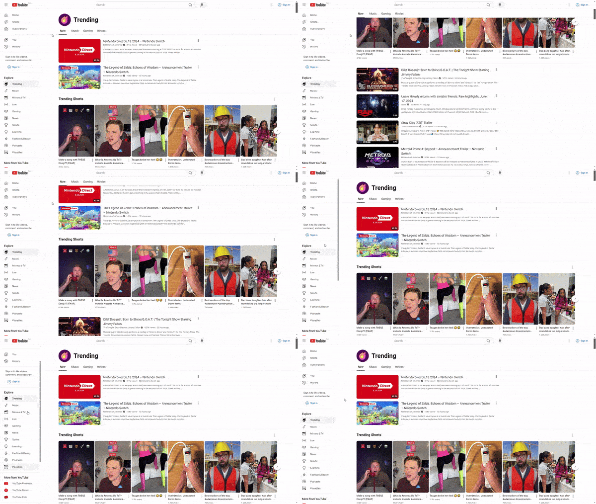
Some sidebars will be scrollable, as in you can scroll them to reveal more of their content, like with YouTube's sidebar:

Other sidebars will stick with you, but change it's position depending on whether you're scrolling up or down, like with Twitter (now X)'s right sidebar:

And other times...the sidebar will just sort of stay there, like with Stack Overflow's right sidebar:

For how old sidebars are, you'd assume we'd have come up with some kind of standard for them by now. Actually, maybe we have.
I imagine this is the default "go-to" when it comes to making vertical navigation. Just chuck a position: sticky; div to the side and set max-height: 100vh, while perhaps subtracting the height of a fixed navbar if there is one.
.sidebar {
    position: sticky;
    top: var(--navbar-height);
    height: calc(100vh - var(--navbar-height));
    overflow-y: auto;
}
No JavaScript, just plain old CSS.
<div class="navbar">
    <p>Navbar</p>
</div>
<div class="container" id="sidebar-container">
    <div class="main-content">
        <p>Main content</p>
    </div>
    <div class="sidebar" id="sidebar">
        <p>Sidebar with lots and lots of content.</p>
    </div>
</div>
<div class="footer">
    <p>Footer</p>
</div>
<!-- Sticky Sidebar -->
<script type="text/javascript" src="/assets/js/sidebar.js"></script>
<!-- Resize Sensor (optional dependency) -->
<script type="text/javascript" src="/assets/js/resize-sensor.js"></script>
.container {
display: grid;
grid-template-columns: 2fr 1fr;
gap: 10px;
margin: 10px 0;
}
.sidebar {
position: sticky;
top: 0;
height: 100vh;
overflow-y: auto;
}
/* Just for demo, not needed: */
.main-content {
min-height: 3000px;
}
.navbar, .footer, .main-content {
border: 3px dashed #FF0000;
padding: 0 10px;
}
.sidebar {
border: 3px dashed #0000FF;
padding: 0 10px;
}
.sidebar p {
border: 3px dashed #00FF00;
padding: 0 10px;
min-height: 1000px;
}
* {
box-sizing: border-box;
}falseThe main feature of scrollable sidebars for me is that the position of its content doesn't change. By that, I mean the top content of the sidebar will always be the top content, no matter how much you scroll the main page.

This is why I find this type of sidebar is best fit for navigation. For example, you'll typically want the first elements of your navigation—such as the homepage link—to always be accessible.
On the other hand, with sticky sidebars, the content of the sidebar is not always in the same position—at least with the specific implementation I have in mind where the sidebar's position is different depending on whether you're scrolling up or down.
In this case, it is actually the bottom content of the sidebar that is most accessible—as when you scroll down, it is the last elements of the sidebar that will most-likely be in view.
What I like a lot about this kind of sidebar is how you figure it out naturally. As you scroll down the page, you may notice it's the end of the sidebar that is in frame. And if you want to access the top of the sidebar, you'll naturally start scrolling up anyway.

I imagine this kind of sidebar works best for things like related content and anything non-critical but useful to have, such as author information.
Oh. And ads. This type of sidebar is perfect for ads.
Another consideration for sticky sidebars: unlike scrollable sidebars—which can be achieved with just CSS—this specific implementation needs some JavaScript.
Personally, I use Sticky Sidebar when implementing this kind of sidebar. Unfortunately, this use of JavaScript can be seen as a downside for this type of sidebar, as not everyone loves widgets that use JavaScript.
<div class="navbar">
    <p>Navbar</p>
</div>
<div class="container" id="sidebar-container">
    <div class="main-content">
        <p>Super long main content.</p>
    </div>
    <div class="sidebar" id="sidebar">
        <div class="sidebar-inner" id="sidebar-inner">
            <p>Very long sidebar.</p>
        </div>
    </div>
</div>
<div class="footer">
    <p>Footer</p>
</div>
<!-- Sticky Sidebar -->
<script type="text/javascript" src="/assets/js/sidebar.js"></script>
<!-- Resize Sensor (optional dependency) -->
<script type="text/javascript" src="/assets/js/resize-sensor.js"></script>
.container {
display: grid;
grid-template-columns: 2fr 1fr;
gap: 10px;
margin: 10px 0;
}
/* Just for demo, not needed: */
.main-content {
min-height: 3000px;
}
.navbar, .footer, .main-content {
border: 3px dashed #FF0000;
padding: 0 10px;
}
.sidebar-inner p {
border: 3px dashed #0000FF;
min-height: 1000px;
padding: 10px;
margin: 0;
}var sidebar = new StickySidebar('#sidebar', {
// The sidebar container
containerSelector: '#sidebar-container',
// The sidebar inner
innerWrapperSelector: '#sidebar-inner',
// Top and bottom spacing (such as to account for a fixed navbar)
topSpacing: 10,
bottomSpacing: 10,
// When the sidebar should wrap
minWidth: 0
});Fortunately, it's not too hard to make a fallback where the sidebar will become scrollable or stay put if JavaScript is disabled.
These kinds of sidebars confuse me the most. My logic is why even include a sidebar if it will only ever be accessed at the top of the page. At that point it doesn't make much of a difference if you include it in the main body.
Even in Stack Overflow's case, I just don't see why they chose to keep the sidebar stuck. Wouldn't you want all this juicy related content to always be accessible?

Regardless, the main benefit I see to this kind of sidebar is it's lack of intrusion. Unlike the other two kinds of sidebars, which will follow you and never leave your side, this type of sidebar gives you room to breath.
And that's something I would expect to see on small, indie blogs. But for large commercial sites like Stack Overflow? Seeing them choose this approach over a scrollable or sticky sidebar surprises me.
But one thing is certain: this is definitely the easiest kind of sidebar to implement. No using CSS calcs to measure the height for scrollable sidebars or JavaScript to change the position of sticky sidebars on scroll. Just some simple CSS flex:
<div class="navbar">
    <p>Navbar</p>
</div>
<div class="container">
    <div class="main-content">
        <p>First paragraph. Lorem ipsum dolor sit amet, consectetur adipiscing elit, sed do eiusmod tempor incididunt.</p>
        <p>Second paragraph. Lorem ipsum dolor sit amet, consectetur adipiscing elit, sed do eiusmod tempor incididunt.</p>
    </div>
    <div class="sidebar">
        <p>Sidebar content.</p>
    </div>
</div>
<div class="navbar">
    <p>Footer</p>
</div>
.container {
display: flex;
gap: 10px;
}
.main-content {
flex: 1;
}
.sidebar {
width: 100px;
}
/* Just for demo, not needed: */
.container {
margin: 10px 0;
}
.navbar, .footer, .main-content {
border: 3px dashed #FF0000;
padding: 0 10px;
}
.sidebar {
border: 3px dashed #0000FF;
padding: 0 10px;
}falseOr even using grid:
<div class="navbar">
    <p>Navbar</p>
</div>
<div class="container">
    <div class="main-content">
        <p>First paragraph. Lorem ipsum dolor sit amet, consectetur adipiscing elit, sed do eiusmod tempor incididunt.</p>
        <p>Second paragraph. Lorem ipsum dolor sit amet, consectetur adipiscing elit, sed do eiusmod tempor incididunt.</p>
    </div>
    <div class="sidebar">
        <p>Sidebar content.</p>
    </div>
</div>
<div class="navbar">
    <p>Footer</p>
</div>
.container {
display: grid;
grid-template-columns: 2fr 1fr;
gap: 10px;
}
/* Just for demo, not needed: */
.container {
margin: 10px 0;
}
.navbar, .footer, .main-content {
border: 3px dashed #FF0000;
padding: 0 10px;
}
.sidebar {
border: 3px dashed #0000FF;
padding: 0 10px;
}falseMaybe that's why the stuck sidebar is so popular.
Sidebars in specific require a lot of mobile considerations since they're really only possible on desktop and tablets...good luck fitting a sidebar on a phone.
For scrollable sidebars—especially when used for navigation—putting them behind a hamburger menu makes most sense to me. Especially since if you're making your sidebar scrollable to keep its content easily accessible, you probably want it to be accessible from anywhere on your page via a fixed menu.
For sticky and stuck sidebars, it probably makes sense to wrap it after the content. Unlike scrollable sidebars, which are typically for important links like navigation, these sidebars are best suited for less important links. Like related content, which could easily be chucked under the article for mobile users.
Personally, I use scrollable sidebars for navigation—which I will put to the left of the content. I'll either use sticky or stuck sidebars for related content and things of the like, which I will typically put to the right of the content.
One final consideration: sidebars are typically not for important content. Any important content should be in the main body of the page, not tucked onto the side. If your sidebar does include important content—like navigation links—make sure it is easily accessible on narrow devices like phones. Put it behind a fixed hamburger menu or put it ahead of the main content (instead of after) on mobile.
So yeah. That's a lot of words for what seems to be a super popular web design widget.
